"The House Of The Vernacular" is a surreal installation bringing together seven diverse collections of vernacular photography. The exhibit is at 'fabrica', a converted church, which only adds to the 'oddness' of this experience!
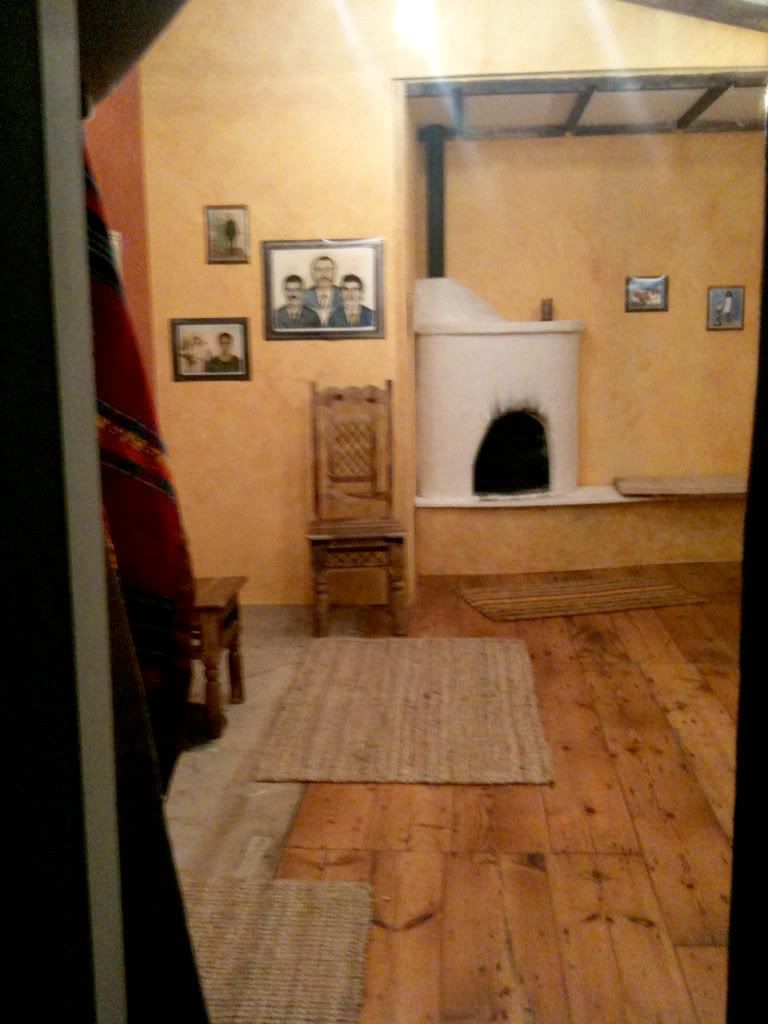
The first room is filled with Brazilian 'Photo Paintings' by Titus Riedl, based on the trend of painting over family portraits, the modern versions are of course done by computer manipulation, not as interesting!! The room is decorated like a Brazilian living room, with the pictures even being exhibited with printed frames around them (to agree to the Biennial 'no framing' rule). The portraits are the epitome of 'so bad, its good' and there's even a Martin Parr portrait hidden amongst the others.
Next there is an American front room featuring a projection of amateur 'American Life' snapshots, 'Archive of Modern Conflict' which i was always going to find fascinating, I'm an avid fan of anything American and Retro.
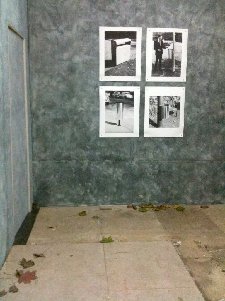
Next you enter a dead-end street in a council estate, with pictures of litter bins taken from the 'Design Council Archive' from the 1950's to the 60's plastered over the brick walls, there's even autumn leaves and litter scattered over the floor (aesthetically, this was my favourite room)
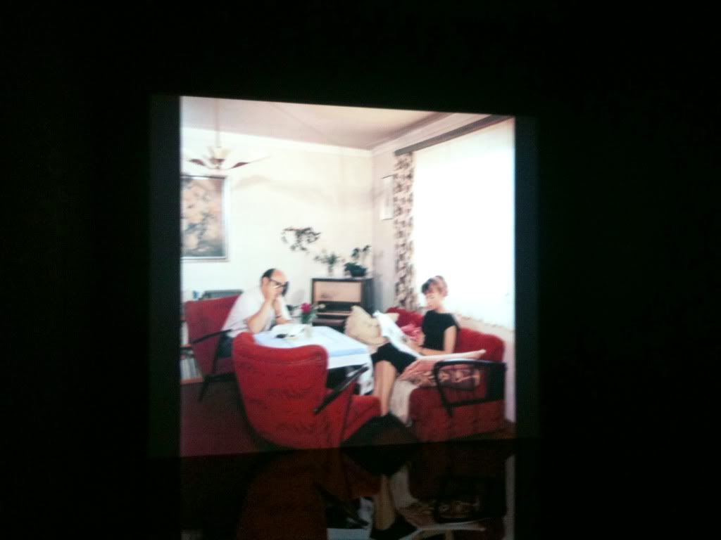
Around the back of one of the brick walls was a slideshow of 'Wirtschaftswunder' by Josef Heinrich Darchinger which he shot for the German Ministry of the interior during the cold war period. I believe that the projection was above the old alter area of the church, which provided a black shiny surface for the images to reflect upon, much like the room was filled with water, it really made the photographs look beautiful.
The fifth room was the most bizarre of all, for someone who's never flown, it was quite disorientating to find myself in the interior of a 70's plane! This was my favourite collection of images, showing the unbelievable tacky 'luxury' of African Dictators private jets taken by Nick Gleis.
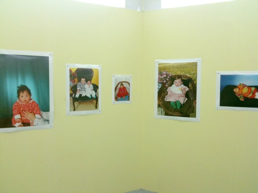
Needless to say, the 'Babies and Children' portraits by Lee To Sang was my idea of hell. Lurid portraits of dolled up children covered the sickly yellow nursery walls. Absolutely terrifying, it's amazing how cruel parents can be!
The location of this exhibited enables it to be the most exciting adventurous show of the entire Biennial, it's not something i would usually enjoy (with it being so OTT) but as it's Brighton, they got away with it!
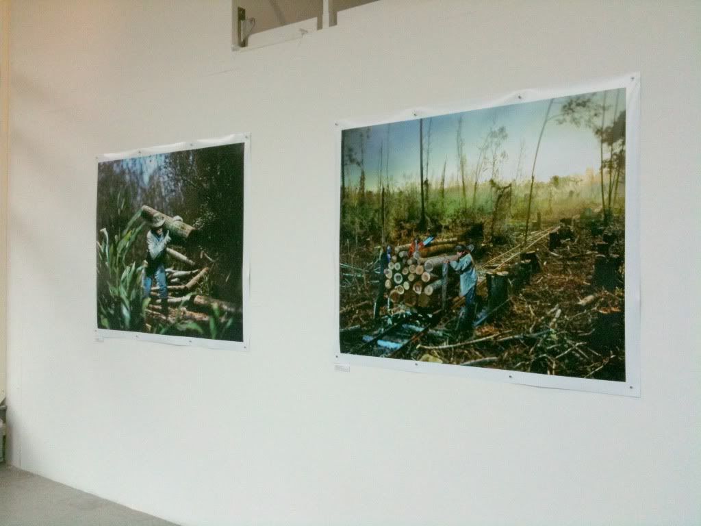
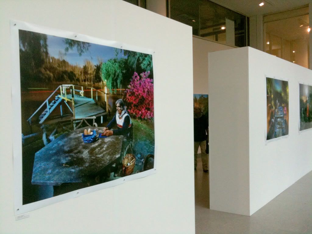
My favourite body of work from the Biennial was Alejandro Chaskielberg's "The High Tide" which was exhibited at The University of Brighton Gallery. At first glance, i was worried that the entire exhibit was on small prints, luckily, only a few were printed a smaller size. However, i would say that the curatorial decision to print everything digital severely affected this work, considering they had been shot on 5x4, naturally c-types would have brought out their vibrancy and detail so much more successfully. Sadly, he had to follow the rules, which mean the colours suffered.
By lighting his photographs with a full moon (and only a touch of flash), and his use of shift focus, Chaskielberg creates a cinematic and deeply atmospheric feel to his portraits. His use of the figures within the overpowering natural landscape is similar to the idea behind my project 'Thrive', if only i had captured the magic he has!
There are certain patches of coloured light which are almost ethereal, I can't imagine how he created such vibrancy whilst being in the centre of such overbearing surroundings! Dragging a 5x4 camera through jungle is certainly an achievement!
An absolutely fascinating body of work.

"New ways of Looking" at the former Co-op Department store featured several of my favourite photographers, in an environment i'd describe, at best, as 'unsafe'. Asbestos anyone?
Regardless of this, some of the work actually worked brilliantly with the building! To see Viviane Sassen's "Flamboya" in the flesh was wonderful (despite the digital prints not showing them to their full vibrancy!) The effect this series have is truly captivating. Any children at the show made a beeline for this work, constantly asking questions such as "why does he have paint on him?" "why is she hiding in that tree?" etc etc...one child even GRABBED one of the prints...made me feel quite ill. But yes, utterly beautiful work that is currently being imitated by many 'fashion' photographers out there...to no avail.
It was good to see Dhruv Malhotra's "Sleepers" and Suzanne Opton's "120 days in Afghanistan" but for me, both were lacking in something...or perhapes were just incorporating too many prints...or were just shown in a too-small space...it was hard to decide. The less said about Ju Duoqi's "The Fantasy of Chinese Cabbage" the better...
I was utterly blown away by Wout Berger's "Big Bend Badlands", this was one project which the printing and presentation worked in it's favour. He exhibited around 10 large scale, extremely detailed images of terrain, scrubland and landscape. Basically, everything i love! I found i could get utterly lost in these prints, due to their impressive size, practically wall to ceiling! I would love to see some of his images exhibited his own way very soon, he's definitely a new inspiration for me.

Upstairs, i very much enjoyed "The Anachronistic Album" by Laura Braun, Heather McDonough and Melanie Stidolph. They had collected together excerpts from their own work alongside family photographs, tracing sensibilities and subject concerns through cultural and family ties. The work is partly inspired by Geoff Dyers book "The Ongoing Moment" (which i need to read very soon). I just found this work to be totally unpretentious, honest and caring. Some of the images were utterly fascinating, and i found the placement of the images very enjoyable to walk through, it was a glorious family tree, threads of memory and emotion (basically, EVERYTHING i love).

My last stop was at my past lecturer Jason Evans show "Nothing is in the Place" which was in the basement of the dilapidated Co-op building. His wonderful curation meant the show looked brilliant in such an environment, and I spent nearly an hour wandering the stream of images that were remembering life in 1990's Britain. The chosen images portray the time of unrest and upheaval, mixed with the iconic youth culture and music scene. It is truly exciting show, beautiful photographs from Vinca Petersen, Paul Seawright, Nigel Shafran and Helen Sear all provide evidence of why 90's British photography was just so wonderful, the beauty in the restless and the mundane.

FINALLY, the "Strange&Familiar" show at Brighton Museum featuring Stephen Gill, Rinko Kawauchi and Alec Soth, for me, Stephen Gill's felt the most 'together'...it's hard to explain, but his prints looked great together, combine this with a trophy table full of the objects that he collected arranged in anatomical precision, and it's instantly a hit for me!
Alec Soth's room looked great too, the choice to print a few chosen images on pink paper instead of white really gave the work a happy, 'full of life' feel...He even featured "The Brighton Bunny Boy" at the very end! I also thought his was the nicest book of the three.
Rinko Kawauchi's work was split amongst two rooms, separating the starling photographs from the people photographs, which was an interesting choice that worked well. I particularly liked the 'jogger' photograph in the second room. However, she confided to Thom that she would exhibit it very different if she showed it again, which i'm sure would show off the work to it's full potential if done HER way! The size of the images was perfect, but I was very sad to see that my favourite image of the "ghostly seagull" wasn't featured!
This exhibition was absolutely PACKED though, so I would love to have had a better look around!
I was very sad to discover that "Myths, Manners and Memory" isn't actually IN Brighton?!? So that's the next trip! I can't pass up an opportunity to see William Christenberry prints in the flesh!
So all in all, i had a very enjoyable and educational BPB. It was an absolute joy to see Viviane Sassen's work in the flesh, and i am left utterly inspired by "The High Tide" and "Big Bend Badlands". This was a harsh reminder that i haven't been taking many photographs recently...i need to address this ASAP. At least i have some new inspiration!
For me, the choice of digital prints and no framing did dampen things slightly, but I understand the funding issues they were up against.
Now it's time to head over to the east London Photo Festival!
Fashion week?? Pfffffffffft, it's all about Photo month! Get it right!
Thanks for reading!


No comments :
Post a Comment